Hi everyone! I’m excited to present you the new release today, Marta 0.8.1. There are many changes and a few announcements, and I can’t wait to cover them all!
New Look Up
Look Up was introduced in Marta 0.4.2. Many users liked the feature, as it made it much easier to navigate through the file system. Even if you remember the location of the particular folder, it’s much more convenient to press ⌘P and type a few letters of its name instead of diving through the folder hierarchy.
However, sometimes you need something more than just a name-based search. For example, you might want to filter results by their type, content, author name, or whatever else. While Look Up supported a few basic predicates, the feature wasn’t quite easy to use. One needed to remember various prefixes with semi-random characters (@: to match by a substring, t: to search in the document title, and so on). Also, it wasn’t possible to combine predicates, so you couldn’t search documents with a title that starts with a particular word or match files both by names and authors simultaneously.
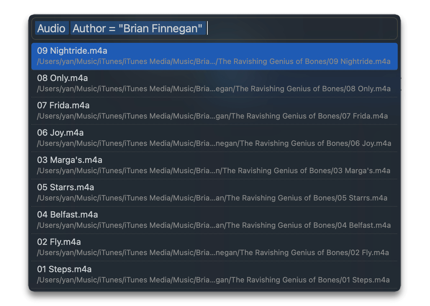
That’s why in Marta 0.8.1, Look Up was redesigned from the ground up. Now it’s much more functional, flexible, and convenient. By default, it still searches files by a name prefix. However, you can add various predicates and combine them as much as you want. In addition, Marta recognizes predicates as you type and suggests adding them to the query.

You can find the complete list of available predicates in the documentation. Here I want to put a couple of examples to explain how things are working:
Text↵ todo– find text files which name starts with “todo”.Folder↵ Name has Projects↵– find folders with names containing the word “Projects”;Audio↵ Author is "Brian Finnegan"↵– find music by Brian Finnegan (see the screenshot above).
Text, Folder, and Audio in the examples above are simple predicates. You type a few letters of the predicate name, and Marta will suggest adding it to your search query.
Name has Project and Author is "Brian Finnegan" are complex predicates. They accept a comparison operator (such as has, contains, or startsWith), and an argument. If you have experience with SQL, complex predicates are much like conditions in WHERE clauses.
New Preferences Editor
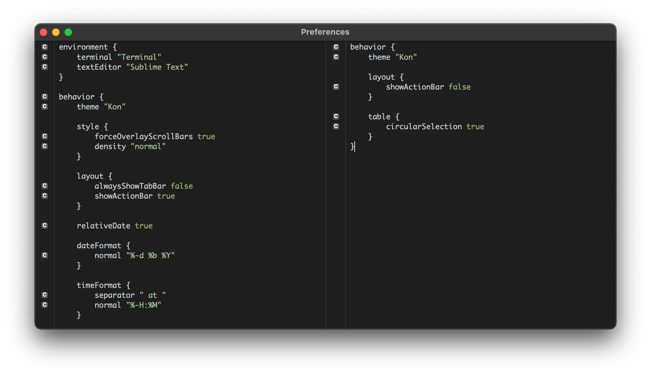
Since Marta migrated to the Marco configuration syntax, it used Fragaria – a library that provides a text editor widget with code highlighting, error reporting, and basic completion functionality. It was pretty easy to set it up, yet I was never satisfied with its quality. Lack of extensibility, a myriad of subtle bugs with indentation and scrolling, and sporadic crashes made me think of a replacement.
I couldn’t find any adequate alternative on the web, so I wrote the new implementation of a code editor by myself. It already covers all the functionality that Fragaria provided, understands indentation much better, and it’s easy to extend the library. I’m looking forward to providing more and more use-cases for the new editor!

New Marta Icon
I bought the first Marta icon in 2016, several months before the first public release. Then I couldn’t afford to be picky about the design – I just needed an icon that won’t be ugly so it won’t scare people away. I found a yellow flower pretty lovely – it felt lightweight and warm, just as I wanted. And it was round, as most macOS icons that time.
Several years passed, and here came macOS Catalina with the all-new UI. According to the updated Human Interface Guidelines, all icons should now be round-angled and have a touch of 3D. The Marta icon began to feel a bit foreign, and it was clear that it needs a replacement.
This time I wanted a truly unique and recognizable icon that will reflect the essence of Marta. So I spent quite a lot of time figuring out what exact metaphor would fit all my requirements. Of course, the first idea that might come to mind is a fancy folder picture, but I wanted to move away from apparent patterns and make something a bit more creative.
However, it was my first experience in such an area, so it turned to be much more challenging than I thought, yet enjoyable. After numerous failed attempts, I drew a rather detailed image of a two-pane file manager, inspired by the sophisticated design of the default macOS icons. But I quickly realized that all the details are poorly distinguishable when the icon is small, and I don’t need them at this stage. So I started to simplify things and came to the very essence of the icon.
Two panes! How simple and clear.
Then I spent some time experimenting with different color palettes. I was especially concerned about how the icon looks in the Dock. Marta is a kind of application you always have launched, and screaming colors will take attention and annoy users. The orange-yellow combination, similar to the old icon’s palette, I liked the most:
Great! The background part is complete. But what should be in the front? I ran out of ideas, so I finally decided to call for help. However, I was surprised that it’s tough to find the right person to design the icon. Basically, you have to choose between a myriad of freelancers who will make you anything, but with somewhat unpredictable quality, and a few top-grade icon studios with “Contact us” level prices. I found nothing in between.
Fascinated by works on Dribble, I contacted several freelancers from different countries. They appeared super excited at first, but all of them started to ignore my messages as we began to dive into the details. I’m not sure how to interpret such a coincidence, but, well, at least I didn’t lose any money.
So I decided that Marta deserves professional hands and contacted The Iconfactory, the leading icon studio with an outstanding portfolio. You’ve probably already seen their works: they draw emojis for Twitter and Facebook. And if you’re not impressed enough, it’s them who made the icon set for Windows XP!
As you can imagine, designing an icon in such a distinguished studio requires plenty of money. While I had to take a significant part from my pocket, I’d never convinced myself it was a good idea without the help I get from glorious supporters on Patreon.
I was very lucky to work directly with Corey Marion, the Iconfactory founder. And it was a fantastic experience! I don’t even say I genuinely love people who don’t abandon their profession for being a manager.
We were discussing some initial prototypes when I thought it would be nice if Marta had a mascot. So I made the most of my poor drawing skills, and here came the fox:
It was a perfect match. Foxes are quick and smart (just like Marta 😁), and they look gorgeous on orange-yellow. In Japan, where I live, foxes are thought to be incarnations of Inari, a powerful goddess of prosperity and luck.
I sent my sketches to Corey, and he greatly improved the idea by blending the fox into the background. So here is the result!
I hope you like the new icon, just as I am. ❤️
Thank you very much, Corey!
Web Site Updates
New Domain: marta.sh
Together with the icon update, Marta got the new domain name. Now the project lives on marta.sh.
A shorter address is easier to pronounce and remember. As word of mouth continues to be a primary way of getting people to know about Marta, I think changing the domain makes perfect sense!
New Documentation Page
I prepared the first version of the documentation page shortly before the 0.1 release. At that time, I didn’t know what people are interested in, and there were many things to cover. So I decided that some documentation is better than nothing and prepared a single long read.
Since that time, Marta evolved significantly and got many new features, though the docs didn’t change that much. As it was a single page, there was always a compromise between adding more information and keeping its size tolerable. Recently I needed to cover the new Look Up action, and I took the opportunity to split the documentation to multiple sections, adding screenshots and details where needed.
Also, I’m working on a few new API tutorials that I plan to release in a couple of weeks:
- C interoperability
- Swift interoperability
- Using Swift for showing UI
No More Google Analytics
A month ago, I removed Google Analytics from the website. If you don’t know, it’s a popular service that allows web administrators to analyze the audience and understand what pages are visited the most. The problem is that Google is an advertisement company, and it uses its analytics service to gather data about users to display to them the most relevant ads. I care about the people who use Marta – that’s why I decided to get rid of its tools.
Now I’m experimenting with Netlify Analytics and Plausible. These products aren’t as powerful as their popular alternative, yet they respect users’ privacy and don’t use cookies.
Download
There are plenty of things to try in 0.8.1. I hope you like the new version!
The latest version is available on the download page. If you already use Marta, run the Check for Updates action.
If you like Marta, please support its development by becoming a Patron!
Thank you, and have a good August! 🦊